

From February 3 to 5, Liferay welcomed its global teams and partners to Athens for the Liferay Sales Kickoff (SKO). During this annual event, Liferay presents its strategic direction and new features for the upcoming year. Liferay SKO is the place where sales, marketing, and partners come together to get inspired, share insights, discuss best practices, and discover new innovations within Liferay.
ACA Group was also present to further discuss our strategic partnership and initiate several joint initiatives. Curious about the most notable announcements from Liferay Sales Kickoff 2025? Discover them below!
* Disclaimer: The information and announcements mentioned below are based on Liferay's current insights and plans and are subject to change. New features and products may still be modified or delayed.

Liferay PaaS Premium Security
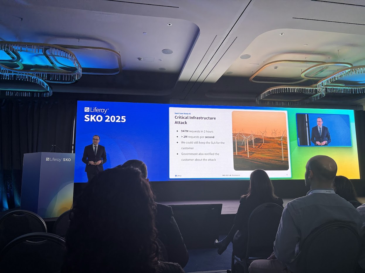
Liferay’s SaaS platform was already equipped with an advanced AI-driven firewall that has repeatedly proven its effectiveness. Through several case studies, Liferay demonstrated how this smart security system effortlessly blocks millions of attacks, all this without any intervention from partners or customers.
Now, Liferay is bringing this proven security technology to the PaaS platform! With the Hyper Security Pack, PaaS users gain access to the same powerful protection that SaaS users already enjoy. What’s included?
🔹 ML DDoS Protection – Robots versus robots! The AI-driven DDoS protection from SaaS is now available for PaaS.
🔹 Blocking Bots – Advanced filters separate humans from machines and offer regional configuration options.
🔹 Scaling Insurance – Liferay automatically scales with your DXP at no extra cost.
🔹 Vulnerability Notifications – Immediate alerts for critical vulnerabilities, plus assistance with patching.
🔹 Vulnerability Report Processing – Submit your security report to Liferay and receive a prioritized list of action items.
For SaaS users, this protection is included by default, while PaaS users can add this package as an add-on.

Liferay Digital Days: training and events for customers
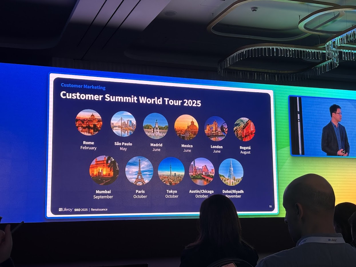
Liferay is launching Digital Days! These hands-on training sessions will introduce you to the latest features. But that’s not all, because Liferay is also taking the Customer Summit World Tour around the globe in 2025! These large-scale events will bring together partners and customers, providing the perfect opportunity to immerse yourself in the latest trends, insights, and possibilities within Liferay.

Teaser Showcases demonstrate Liferay’s USPs
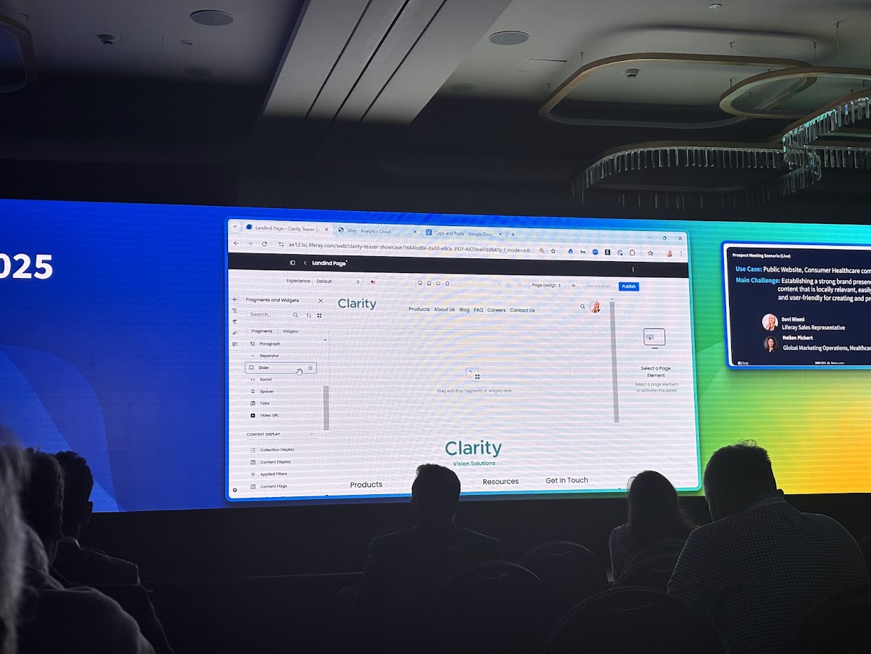
ACA already has multiple Liferay environments to demonstrate the platform’s endless possibilities. Now, Liferay is making this even easier. With 8 Teaser Showcases, we can now present Liferay’s unique selling points (USPs) to potential customers in a clear and compelling way.
These Teaser Showcases are the perfect complement to existing product trials and personalized demos, allowing customers to explore Liferay’s capabilities at their own pace.

Liferay CMS: a small but powerful new addition
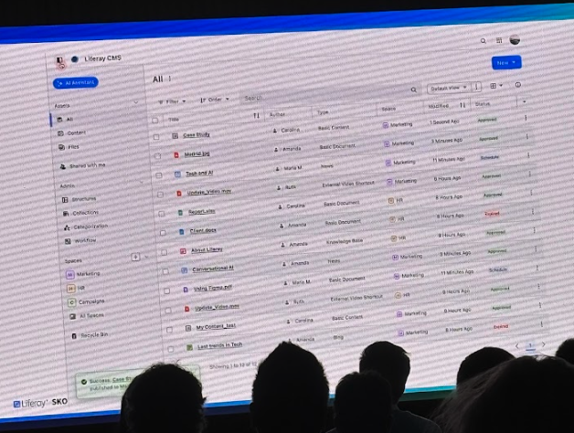
The Liferay family is growing! Later this year, Liferay will launch a new Liferay CMS, a lighter alternative to the comprehensive Liferay DXP. While this smaller version won’t include all the features of Liferay DXP, it is the perfect solution for smaller projects that need a powerful and flexible CMS.
Not all details are available yet, but ACA is closely following the developments. We are confident that Liferay CMS will be a valuable addition to our product portfolio.

Liferay continues to grow
Liferay continues to impress with its global growth! The partner network has now expanded to 400 partners worldwide, with a strong focus on the EMEA market.
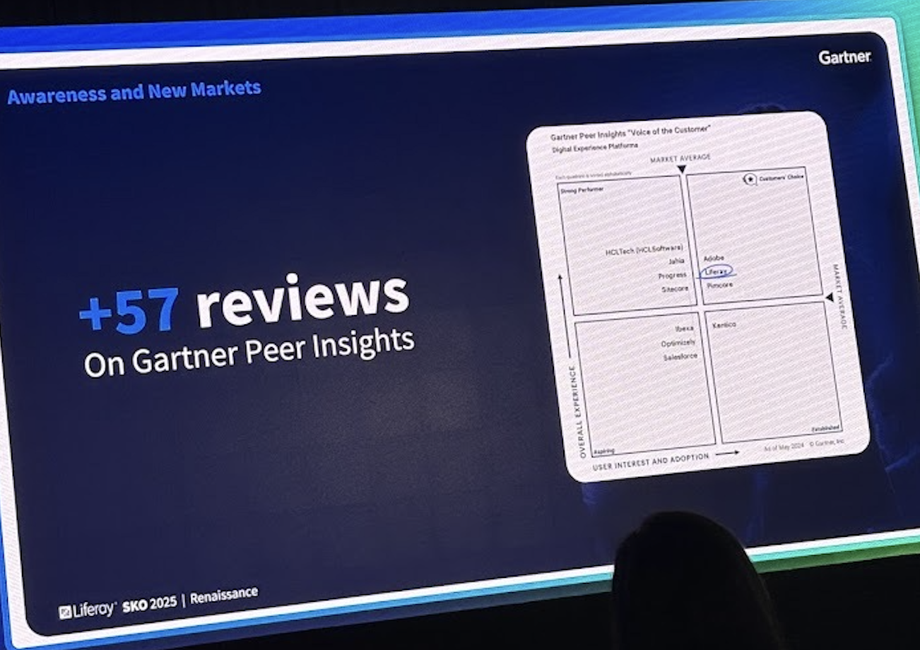
On a product level, Liferay is also making significant strides. In the Gartner Magic Quadrant, the platform continues to move upward toward the Leaders category, a testament to its strength and innovation.
Additionally, Liferay is now ranked among the top three DXP Customer Choice platforms by Gartner, alongside Adobe and Pimcore. It’s a recognition of the trust and appreciation from users worldwide.

Many more new features for Liferay DXP
Liferay also introduced numerous new features for the Liferay DXP platform. Highlights include:
- Customizable Content Editor: Tailor the editor to fit your project’s needs.
- Advanced Export/Import: An improved import/export functionality with staging support and detailed error reporting.
- Camunda integration: Smooth two-way integration with Camunda for better workflow automation.
- Cloud Native Experience: Additional tools to run self-hosted Liferay DXP effortlessly on AWS, Google Cloud, or Azure.
- AI Wizard: A smart AI assistant that quickly creates pages, blogs, and media. Upload a sketch photo, and the wizard generates a complete page structure with fragments!
- Intelligent Search: Liferay’s search function gets a major upgrade. In addition to classic keyword search, there is now a powerful semantic search engine, fully customizable to your needs.

💡Curious about Liferay’s future plans? Check out their public roadmap at https://liferay.com/roadmap.
Get started with the new Liferay updates?
With these new developments, Liferay is taking its platform to the next level, making it more secure, user-friendly, and attractive than ever for both partners and customers. For ACA, it’s a fantastic opportunity to strengthen our market position and fully leverage these innovations.
Want to know how these updates can benefit your organization? We’re happy to think along with you! Contact us!

What others have also read


When building products, there is a growing recognition that success isn’t just about delivering features or hitting deadlines. Instead, it’s about delivering real value to customers and achieving business impact. This requires a shift in mindset from output-driven to outcome-driven thinking. In this post, we'll explore why prioritizing outcomes over output is essential for building successful products, and how you can adopt this approach in your own work. What does “outcomes over output” mean? In the world of business, the terms outcome and output are often used interchangeably, causing a bit of confusion. However, it is important to have a clear understanding of the distinction between these two terms . Although they may seem straightforward, let's define them to ensure we are all on the same page. Let’s imagine you’ve been feeling exhausted lately, so you start working out in the gym to feel more energized. Some people might say that the outcome of your gym routine is the hours you’ve spent working out and the amount of weight you’ve lifted. But the real outcome of your routine is much more significant than that . The outcome is that you feel stronger, more confident, and healthier. The outcome is the way in which your hard work (the output) has translated into a better quality of life and a more positive self-image. The outcome is the way in which your problem was solved by the output. In a business context, an outcome refers to the impact your product has on the organization and its customers and stakeholders, while an output refers to the tangible things your (development) team produces, like documents, software, and tests. Focusing on outcome over output means defining success based on achieving a specific outcome and measuring progress based on how close you are to reaching that outcome. The goal of your team is not to produce outputs; it’s to reach a specific outcome. A successful team strives to maximize the desired outcome while minimizing the amount of work produced. The benefits of an outcome-driven approach 1. It helps you escape from the build trap The first Agile Principle states that your top priority is to make your customers happy by delivering valuable software as early and consistently as possible. As agile practices are adopted in various fields, people have rephrased this principle to emphasize the importance of delivering value to customers quickly and consistently. When you measure success based on an outcome-driven metric, like “ increasing newsletter click-through rates by 15% within six months ”, you immediately connect your team's efforts to the value for your organization and customers. This helps you understand the impact you're making and when you're truly making a difference. In contrast, when you measure success by looking only at the things you produce, such as “ the number of features delivered ” or “ the number of completed points in a scrum sprint ”, you risk running into what Melissa Perri (product management expert, speaker and author) refers to as “the build trap”. This trap involves focusing solely on creating features without considering the desired outcomes. When organizations prioritize output over outcomes, they risk getting caught in a cycle of building more and more features without truly understanding if they are solving customer problems or driving business value. By fixating on feature delivery as a measure of success, you may lose sight of the bigger picture. It doesn't tell you if you're building the right things. So, it is essential to shift your focus to the outcomes that matter. This requires a mindset shift that places the customer's needs and desired results at the forefront. By defining success based on outcomes, your team can escape from the build trap . 2. It helps you focus on learning and iterating When you start thinking critically about value delivery instead of feature delivery, you quickly run into the problem I’ve addressed previously: how can you be sure that the features you’re building are actually going to deliver value? An outcome-driven approach recognizes that you may not have all the answers from the start and that learning is an important part of the process. This is why, when working with outcomes, you need a companion tool: the experiment. When you combine outcome-driven thinking with a process that’s based on running experiments, you really start to unlock the true potential of agile approaches. This is especially valuable in situations where there is a lot of uncertainty. For example, when creating a new software product, you may not be sure if it will have the desired impact on your business or if all the fancy features you came up with are necessary. By focusing on outcomes, you can set goals that allow your team to experiment and try different solutions until they find what works best. In an agile context, we treat each step as a hypothesis and an experiment aimed at achieving a specific outcome. This is where the concept of an MVP, or Minimum Viable Product , comes in. Think of MVP as the smallest thing you can do or the smallest thing you can build to learn if your hypothesis is correct. This iterative process of testing, learning, and adapting allows teams to experiment, to try different solutions, until they hit on the one that works. 3. It helps your team reach more autonomy Employees often find it challenging to feel a profound sense of purpose and motivation solely from the output they produce. What truly drives individuals to show up at work each day is not the specific tasks they engage in day by day, but rather the meaningful outcomes their work will ultimately contribute to . An emphasis on outcomes helps align your team around a common purpose and shared goals. By providing clarity on what needs to be achieved, you can motivate and empower your team to work together towards clear goals that the product should achieve. This allows your team to prioritize their work, and build features that contribute to achieving those goals. Allowing them to make decisions about the features they build, will give a greater sense of ownership over the work they do. Defining the outcomes for your product and implementing them By now, you might agree that focusing on outcomes sounds like a good idea, but actually implementing them in our business practices is not as straightforward . Every methodology has its drawbacks. One challenge is that outcomes are less easily measured and quantified compared to outputs. Secondly, many companies face pressure to quickly move on to the next project once one is completed . Unfortunately, the iterative process of testing, learning, and adapting is still not commonly practiced. Finally, one thing that makes it hard is that we often set goals that are too high-level . For example, when you ask the team to make the business more profitable or reduce risk, it is too complex because those challenges consist of many variables to influence. These impact-level targets are too complex for teams. Instead, you should focus on smaller and more manageable targets . To do this, you need to ask your team to concentrate on changing customer behavior in ways that drive positive business outcomes. In his book “Outcomes Over Output: Why Customer Behavior Is The Key Metric For Business Success”, Joshua Seiden presents three magic questions that can help you identify suitable outcomes: What are the user and customer behaviors that drive business results? (This is the outcome that you’re trying to create.) How can we get people to do more of those behaviors? (These are the features, policy changes, etc that you’ll do to try to create the outcomes.) How do we know that we’re right? (This uncovers the experiments and metrics you’ll use to measure progress.) Let me provide you with an example of how this works. Imagine that you run an e-commerce clothing store, and you’re facing tough competition from a rival company. Your objective is to improve customer loyalty, so you set a broad goal to the team of increasing the frequency of customer visits from once a month to twice a month. To achieve this impact, you need to identify specific customer behaviors that correlate with visiting your site. For instance, you observe that customers tend to visit the site after opening the monthly newsletter showcasing new items. Therefore, one possible outcome could be to increase the newsletter click-through rates. Additionally, you notice that customers also visit the site after a friend shares an image of one of the items on social media. Hence, another outcome to consider is encouraging customers to share images of items more frequently. By focusing on these customer behaviors that drive the desired outcome of site visits, you ensure that your goals are both observable and measurable. This is crucial as it allows you to effectively manage and track progress. I hope this example highlights how outcomes can be specific and easily broken down. Remember, an outcome is a behavior exhibited by customers that directly influences business results. By understanding these behaviors, you can align your efforts with the outcomes that truly matter to your business. Takeaways An outcome refers to the impact your product has on the organization and its customers and stakeholders, while an output refers to the tangible things your team produces, like documents, software, and tests. The goal of your team is not to produce outputs; it’s to reach a specific outcome. A successful team strives to maximize the desired outcome while minimizing the amount of work produced. By fixating on feature delivery as a measure of success, you may lose sight of the bigger picture. It doesn't tell you if you're building the right things. So, it is essential to shift your focus to the outcomes. An outcome-driven approach recognizes that you may not have all the answers from the start and that learning is an important part of the process. This is why, when working with outcomes, you need a companion tool: the experiment. When you’re planning work, be clear about your assumptions. Be prepared to test your assumptions by expressing work as hypotheses. Test your hypotheses continuously by working in small iterations, experimenting, and responding to the data and feedback you collect. Don’t mistake impact—high-level aspirational goals—for outcomes. Impact is important, but these targets are too complex for teams as they consist of many variables to influence. Use these questions to define outcomes: what are the human behaviors that drive business results? How can we get people to do more of these things? How will we know we’re right? 👀 Want to know more about our services ? Click here to find out!
Read more

ACA has been a Liferay Partner for many years, and is even the only Liferay Platinum Partner in Belgium. One of the advantages of this partnership is that we can view and review new products in a pre-release version. We recently received a pre-release version of the new Liferay DXP 7.2, which has just launched in early June. Here’s a short summary of what Liferay wants to achieve with this new version: In this new release Liferay aims to make it easier for the non-technical user to create a smooth customer experience . It realizes this by providing even more tools and updates to already existing tools. Another major upgrade is the fact that Audience Targeting is now included into the core of Liferay . By doing this, Audience Targeting and user segmentation has a better integration with all content building functionalities in Liferay. Liferay focuses on privacy with improvements to the Personal Data Erasure feature introduced in Liferay DXP 7.1. Modern Site Building There have been some vast improvements in the ways non-technical users can provide even better user experiences, something Liferay has been calling the Modern Site Building project since Liferay DXP 7.1. Its new features are related to Content Pages , Display Pages , Fragments , Navigation Menus and Pages Administration . Content Pages Next to an improved visual representation of the content pages, there are also several upgrades to the styling abilities for business users. Business users can now… adjust background colors, images, spacing, and more for sections in the Content Page. get an indicative view on the layout of a Content Page while creating them. Using the Section Builder on the right hand side, different kinds of layouts can be added to the Content Page. Several come out of the box, designed by Liferay itself, providing various amounts of columns. customize layouts on the fly and with regards to the specific context of a page. With the help of a bootstrap-like visual representation, the width of the columns can be easily adjusted by dragging the columns. It’s now also possible to provide a background color or even an image to the layout. adjust the number of columns, spacing, padding, margin and more thanks to the small options menu. To populate these layouts, Liferay provides several basic components called Fragments out of the box. These Fragments consist of several basic HTML components such as different kinds of headers, text fields, buttons, images, and cards (where some basic components are already grouped). There are also several predefined sections that combine layouts and components into more complex components, that are ready to be added to the page. Several types of headers, footers, banners, a highlight center and much more are provided! One thing that is very neat about all these components is that they can be linked to a Web Content Item. Any field of the content item can be used for the elements in the component. This allows the user to maintain the content in one place (the content management section of the site) and reuse it, or parts of it, in different content pages. Since Liferay DXP 7.1, business users were able to add widgets to Content Pages. A developer needed to create a Fragment that included the widget, which a business user could then configure. With the upgrade to Liferay DXP 7.2 however, business users are able to add any widget to any fragment directly, so they can make use of e.g. the asset publisher, web content display, alerts, wiki, blogs, … All of these updates are now performed within the context of the actual page. The styling and fixed components such as headers and footers and the behaviour of the Theme are directly applied to the Content Page. A business user can edit them while looking at it as end user, providing a more realistic experience of content editing. Display Pages All of the above changes for Content Pages are also valid for Display Pages, since they rely on the same building blocks. The major update here is the possibility for a developer to add support for Display Pages in custom entities. By ways of implementation, devs can provide the necessary options for webmasters to select specific Display Pages for the item. Webmasters will then see a dropdown option list to select which Display Page should be used. Fragments We have mentioned Fragments before as the building blocks to compose Content and Display Pages. They are typically created by a web developer and used by the webmaster. They are defined by an HTML block together with CSS and possibly JavaScript for dynamic behaviour. Liferay improved the Fragment Editor, which can be found in the Control Panel, to develop these Fragments. The Fragment Editor now also provides a form of code completion for the default lfr tag library. The Fragment can also be provided with a resource or a collection of resources that can be used in the Fragment. These are actually images that can be referenced by name either in the Fragment itself or in the supporting CSS (e.g. for the background image). The offline development for Fragments has also been made easier by Liferay through the Fragment Toolkit. This is a new npm tool to generate a Fragment module, which allows for offline development of a Fragment in an IDE of choice. The Fragment module can also be added to the codebase of the project and deployed on all environments. Navigation Menus Liferay DXP 7.1 introduced Navigation Menus to detach site navigation from the page hierarchy. Some improvements have been made in light of: moving pages in the hierarchy; selecting both public and private pages for the menu; adding back the ‘hidden’ option for pages to pages won’t be shown in any Navigation Menu; automatically adding a page to a Navigation Menu. Page Administration To easily navigate through pages while editing them, Liferay added the option to search and find Pages more easily through: a search bar in the page administration for search by text; the Page Navigation tool in the dockbar for Site administrators, which now provides a dropdown menu with search functionality; improvements in the visualizations of the page hierarchy and structure. Content Authoring While above updates concern the authoring of pages, there are also improvements to authoring content itself. One of these improvements now includes the possibility for webmasters to see an overview of the usages of the Content Item . These usages are determined by the Web Content Display and the Asset Publisher portlets as well as the usage in Fragments through Content Pages and Display Pages. So now, webmasters can clearly identify where in the Site any possible changes will impact the end user. Another improvement is that it is now easier for webmasters to preview the web content in all phases of the workflow and in different kind of contexts. Users can select different templates, see the preview of a Display Page Template and within a page the content item is already added. There have also been updates in terms of the content structure and templates. From Liferay DXP 7.2 and newer, it’s no longer required to select a template for a Content Item . As discussed above, Content Items can be used in Fragments for Content Pages and Display Pages. This means it’s possible that the Content Item is no longer represented by a template. Finally, the view for creating a structure and editing a Content Item has been updated . It now looks cleaner, with a clear separation between content and metadata. Audience Targeting With Liferay DXP 7.2, the Liferay core includes the Audience Targeting module. The Audience Targeting module allows for better and even more integration points with other core Liferay functionalities. Because of this change, a small migration process is necessary for current Audience Targeting customers . This should be a semi-automatic data migration process with preservation of existing segmentations. The Audience Targeting module itself has been moved outside of the Control Panel and can now be found under Site People Segments . Speaking of segments, it’s still possible to define segments based on rules. Rules can be created using User properties, Organization properties and Session properties. Much of this will sound familiar to the Audience Targeting customer. One nice adjustment, though, is that Custom Fields are now directly accessible from the menu. Customers using Liferay Analytics Cloud will also be happy to hear that from now on, the segments defined in Analytics Cloud can be reused in Liferay DXP . This means that segmentation in DXP can now be directly based on the user information or behavior and interests gathered in Liferay Analytics Cloud. Because of the integration of Audience Targeting into the Liferay core, the Liferay developers also provided several APIs to obtain information regarding user segmentation. This allows external applications that make use of Liferay content management capabilities to also apply user segmentation. Information that can be retrieved include the segments of a site, the segments to which a user belongs and even the users belonging to a segment. Personalized Experiences Using user segments in Content Pages is also available in terms of providing Personalized Experiences . When designing Content Pages, a webmaster can differentiate the sections and the content based on User Segments. Using the new Experience Administration option, these experiences can be created and managed through a simple UI. The order of the Personalized Experiences is important here as it signals priority. When a user belongs to multiple audiences and thus multiple experiences, the one with the highest priority (top-down) will be applied. Sadly though, this experience personalization is not applied to the Web Content Display portlet when present in the Content Page. This portlet will always show the same Content Item regardless of the selected experience. Content Sets Another novelty in light of Audience Targeting is the definition of Content Sets. This is a collection of Content Items that can be reused on the site pages using the Asset Publisher portlet . When creating a new Content Set, the content items that make part of it will be defined statically or dynamically by defining rules. You can differentiate those rules using user segments. Similar to the Personalized Experiences for Content Pages, Content Sets can contain different rules based on the user segments. In this context, they’re called Personalized Variations , but the functionality is pretty much the same. Although it is unclear if there is any priority applied here. These Content Sets are also available through the headless API, so they can be used outside of Liferay to obtain content variations based on the user segment. One oddity I came across when reviewing Audience Targeting, is that when User Segments are created, they are not available anymore for categorization of Content Items. In previous versions it was possible to use the User Segments as a sort of categorization for content items. Under ‘Metadata’, a new section called ‘User Segments’ would appear as soon as the user segments were defined. However, given the options of segmentation in Content Sets, Content Pages and Display Pages, Liferay probably has just omitted this usage of user segments. DMS Features Liferay’s Document Management capabilities have also gotten an upgrade. An integration with Google Docs is now available , so these types of documents can be created and edited within the Google context. The document is eventually stored in the Liferay DMS itself. You’ll need to create a Google Drive API for your project and provide that information in Liferay to start the integration with Google Docs. For all non-Google users, other significant updates have also been made to the ‘regular’ DMS features of Liferay, mainly concerning the sharing of files, file versioning and bulk editing. Sharing Files Documents and Media can now be shared with other users in the portal , even if they aren’t a member of the Site in which the item is defined. The receiving user won’t see anything of the Site in which the document is created. You can also grant them Comment or Update permissions instead of just a View permission. If you select the Allow the document to be shared with other users option, you’ll provide the receiving user the power to further share this document. The user that you share a Document with, is informed of this through the Notifications system of Liferay. You can locate any shared content from the User profile menu. No specific portlet to list all shared content is otherwise provided at this time. From a technical point of view it is important to know that no new document is created when sharing. Liferay chose to create a new table in the database which holds this sharing information between items and users. After sharing a document, it is also possible to revoke users’ access to it or manage the permissions from the information panel of the document under the Manage Collaborators link. File versioning Webmasters can now manually select a new version when editing a document . Under the tab Versioning , there’s a newly-added slider to activate the manual selection of versioning. The user can decide and provide a new major version or a new minor version, or can even select to have no version upgrade at all. For every selection, it is also possible to provide some comment to inform other users, or just for future reference, what adjustments have been made or why the selected option was chosen. When the activation slider is turned off, which is the default setting, Liferay applies its automatic versioning system. This system in turn has also received some updates and will now always play by the following rules: a major upgrade is created when the actual content has changed. a minor upgrade is created when the metadata has changed. there is no version upgrade in all other cases. e.g. only editing tags, categories, permissions or comments. Interesting to know is that this rule set can be extended as a Versioning Policy API has been introduced. By developing and deploying a custom component, the criteria can be adjusted. One still missing link for versioning is that these options are not available when editing with the image editor. Bulk editing The last major update in the Liferay DMS system is the availability to edit tags for documents in bulk . For now, editing tags is the only option, but Liferay promised to provide categorization as well in the near future. After selecting one or more Documents in the Documents Media Gallery, the Edit Tags options appears in the toolbar. This opens up a modal dialog where all options and shared tags are provided. By selecting Edit , webmasters manage only the listed tags, either deleting one or more or adding new ones for all selected documents. The Replace option will apply only the list of tags to all selected documents, which means all non-shared tags will be removed. This last one is very important to remember as it can cause some side effects where filters on tags will suddenly contain no more items. User Management We’ve already discussed Audience Targeting and some of its noticeable updates. However there have also been some improvements on individual user management. Mostly these are related to GDPR and user data management. In Liferay DXP 7.2, there are improvements in the feature to erase personal data and anonymize content . Personal data can also be exported and downloaded as a zip file that references the related assets. In the User Management section, these actions can still be found in the context menu. An Administrator is now presented with a clean dashboard to perform anonymization. The content can be scoped by the user’s personal site, regular site or instance. The content is shown in a hierarchical manner with filtering options. This provides the Administrator with context about the content items and where they are used. The Administrator can also selectively erase personal data. At the moment, only Documents Media and Message Boards support this new functionality. Exporting personal data is managed in the same way with a similar looking dashboard. When the export process is completed, an overview is shown of the different content items and are separately downloadable as a zip-file. In the process of auto-anonymization, the Administrator can now also see which applications contain data that support auto-anonymization. Extra: Artificial Intelligence Liferay also started embracing the power of AI. One example of this is the auto-tagging of images . This feature reduces the manual actions required by a webmaster and allows for rapid collection building. We’ll surely be seeing more AI functionalities in upcoming releases. The auto-tagging functionality is still at an early stage and therefore only English tags are supported. It is also disabled by default and needs to be activated by an Administrator from the Control Panel. This can however be performed on several levels: global, instance or site. Next to TensorFlow, which is the default provider, Liferay also supports Google CloudVision and Microsoft Cognitive Services. 🚀 Takeaway Liferay DXP 7.2 offers a ton of new possibilities. If you ask me, these are the things that really stand out in this new release: sharing documents; beautiful in-context editing of Content Pages; integration of Audience Targeting, with some caution as to how categorizing Content Items through Segments will happen in future releases; and linking Content Pages with Web Content Items. Are you just as excited about this new release as we are? Then why not join our fantastic team ? 🙂 Thanks for reading! Sources: https://community.liferay.com/blogs/-/blogs/web-experience-new-features-in-liferay-portal-7-2-b1 https://community.liferay.com/de/blogs/-/blogs/creating-personalized-experiences-with-liferay-7-2 https://community.liferay.com/de/blogs/-/blogs/liferay-portal-7-2-ce-alpha-1-release https://community.liferay.com/de/blogs/-/blogs/liferay-portal-7-2-ce-beta-1-release
Read more

Ever wondered why one website is easy to use whereas other sites only bring frustrations? Why you are happy to use that one particular app on a day-to-day basis and you would rather ignore other apps as much as possible? The thing is that, in most cases, the people that designed those practical and widely used products took the user’s needs and requirements to heart. As you will have noticed, far too often, a lot of websites and apps continue to sin against the basic rule of listening out to users’ needs. Which is why this practical guide is intended to help you avoid these frequently encountered mistakes in product design. Every smartphone user knows that their phone slows down or may even freeze if they use too many apps all at the same time. Actually, this is pretty much the same thing that happens in the human brain. Our brains constantly use RAM memory at all times of the day, whether consciously or unconsciously. And this working memory has its limits. It'll start slowing down if it: needs to learn too many new things is overstretched by constantly having to juggle multiple tasks is asked to concentrate for too long is required to activate the memory too often is called upon to make too many decisions in a short space of time is expected to deal with frustration and confusion Unlike computers, humans do not take extra working memory. Which is why our job as UX and UI designers is precisely to relieve users’ working memory. We can do this by showing the shortest and easiest route towards the desired result. In this respect, it's essential that we show information and features as simply and as methodically structured as we can make them. Go for K.I.S.S. - Keep It Simple Stupid! So how do you strike the right balance? This blog sets out five practical tips to instill simplicity into your designs and ways to make user-friendly choices to benefit the users. Definitely worth a read! Don’t make me think Suppose you land on a website’s home page, which looks as shown below. The information is neither particularly clear nor very structured. As a user, you then need to elbow your way through various pages and click multiple buttons. Moreover, you are also invited to create an account and to remember your password. Until suddenly… you’re logged out of your session. Wallop! Can you sense your frustration welling up? All of these barriers combined are a cause of considerable irritation, demand a great deal of concentration and place an unnecessary burden on your brain. What is worse, it stops you from achieving what you set out to do by visiting that website. Which is why it is vital that, as designers, we avoid cognitive thresholds in the interfaces we build, and ideally elsewhere across the entire customer journey. Steve Krug’s book “ Don`t make me think ” is a definite must-read on this topic. So, we now know that every extra element on the page raises the complexity of the interface as a whole and consequently has a negative effect on the way our brain works. Here are five ways to keep your designs simple and focused . 1. Make sure each page has a clear hierarchy People scan a web page by sight, reading that page in the reading direction they are most familiar with. Eyetracking research by NN Group shows that Z patterns or F patterns are very prevalent, especially among readers from the Western world who read from left to right. Users that adopt an F pattern first scan the page in a horizontal movement, usually starting across the top part of the page. They then go down the page a little and continue to read in a second horizontal movement. Finally, these users scan the left hand side of the content in a vertical movement. So make sure the main item you wish to draw the user’s attention to is the central point on the page. In the example seen below, the call-to-action button is the central stand-out point in the mail. Be aware that users will often not even bother reading the text but will directly click a button instead. So focus on the actual call-to-action! 2. Don't make me remember Do you know how many passwords you use online? Do you know all of these passwords by heart? If the answer is yes: congratulations, you could well be a super genius blessed with an incredible memory. Unless you are using the same password wherever you go, which is not exactly the safest way forward either. If your answer to these questions is ‘no’, you are like 99% of the population, and feel slightly panicky whenever you’re asked to enter your login details. Remembering passwords is an everyday battle for many users of the modern web. Tackle the root cause of the problem and stop users from getting frustrated when they are asked to perform actions for which they need to call on their memory. Which is why automating the login process is a must to deliver a positive user experience. One way of achieving this is by way of a login they often use, as with Google accounts. You can also allow a different integration so the user is able to manage their passwords (e.g. LastPass). In e-commerce, you can enable users to check out as guests. This is every bit as much a commercial decision, and one that makes sure users are able to swiftly and easily check out and pay for their shopping basket. 3. Speak the user's language This is an element that is often overlooked. Precisely because good copy is very clear and simple, it often does not get the attention it deserves. One example of confusing jargon is seen in the login process. How do users understand ‘logging in’, ‘signing in’ or ‘registering’? Give the words you use a great deal of consideration so the copy speaks for itself. And be consistent in using the same words throughout the entire interface. The thing that stands out in this example is the simple and straightforward copy. Difficult concepts are described using clear and comprehensible words to make sure every user understands. 4. Goals before options What is your favorite? Pasta, fries, pizza, meatballs in tomato sauce, beef stew...? A salad? Or would you say you have more of a sweet tooth? Struggling to choose? In that case, you're likely to suffer from choice overload. And you are not alone in that. When our brain is faced with too many choices, it is required to process too much information all at the same time, which is what gives us choice overload. The same applies in the digital realm. Showing all of the options on-screen at once stops people from continuing their visit. Too much on-screen information is overwhelming and may create a bottleneck. Our brain is limited in the amount of information it is able to process at the same time. So simplicity also means you do well to limit the number of steps or options the user is presented with on-screen. This enables the user to focus on the task he is performing right there and then. Rooted in psychology This idea is based on Hick’s Law . This psychological principle says that the amount of time needed to make a decision is based on the combination of the number of choices and the level of complexity. When the level of on-screen complexity increases, it also takes people longer to make a decision. If your user is forced to go through a complex process anyway, break up the process into logical steps or limit the number of options. This can be done by only showing certain parts of the process on-screen at the same time. Take checking out on an e-commerce website for example. Instead of presenting the entire process in a lengthy, complex form, break it down into logical steps. First ask users to register their e-mail address and create a password (or enable them to check out as a guest). The next screen could have the details of their shopping basket, followed by another screen that collects the delivery details, etc. Reducing the number of options on-screen makes the payment process more user-friendly, thereby increasing the likelihood that the user reaches the end of the process and pays for the items in his shopping basket. This is a good way of restricting abandonment behavior. Don't overdo it That being said, do not be too quick about scrapping certain options or steps either! It is important that no elements are left out that support the user’s primary purpose for visiting the site in the first place. In other words: always bear in mind functionality from the user’s perspective in limiting the number of choices he is asked to make. Google for instance focuses on one thing only, which is main thing the user is using the search engine for, and that is to run searches. Another thing that can be helpful is to test the interface with people who are more likely to come up against the limitations of their working memory, such as elderly people or people with ADHD. What we are saying is: try testing out your designs with your nan or grandad! And do not be too concerned about the number of times a user is asked to click a button. Users do not usually complain about the number of clicks. What they do get frustrated with is the length of time it takes to complete the task or to find the right item. And the thing that drives away users is pointless clicks. Do not count the clicks, make the clicks count! “Consumers want websites and apps that enable them to make smart choices.” The main thing to remember is that our job is to help users complete their actions swiftly and with ease. Part of that job is to get rid of the least appealing alternatives. Another thing that helps is to offer them different basic functions such as search, sort and filter. This makes it easy for users to find what they are looking for. Or go for a personalized approach and enable them to decide what is shown on-screen. 5. Create visual calm rather than overstuffing the screen White space is very often greatly underrated in interface design, in the same way as silence between musical notes. Yet white space is a powerful way of restricting the amount of visual input and keeping people on your page. Websites and apps often feature a great many different visual elements. These include words, blocks of text, lines, icons, images, etc. The space between these separate elements is what we call white space. The more white space between the elements, the more calm you instil in your interface and the less noise the user has to deal with on-screen. As a designer, this is something you can purposively use by making white space an essential part of your interface. In doing so, white space is no longer the empty canvas you are painting on, but becomes a key component of the painting . In spite of the name, white space does not need to be white. It can be any colour, texture or pattern. It could even be a background image. Unfortunately, white space can also create quite a few problems between designers and clients. The thing is, many clients consider white space as a waste of space, which they prefer to see filled with more on-screen information or extra features. Which is a pity, as white space is very much a great aid to instil a sense of balance between standalone elements, enabling you to create calm and focus on your screen. The reality is that, as people, we get frustrated when we are swamped with information. We are people, not machines. White space gives our mind a sense of calm and allows us to ‘breathe’. Let’s take an example we can all identify with by way of illustration. Few people ever read manuals for fun. Which makes it all the more crucial for the manual writers to hold DIYers’ attention! To do that, white space is the star of the show as it helps to bring out important visual elements. It helps to make sure that DIYers quickly and clearly know what they need to get started. Rather than calling a helpline, DIYers are enabled to resolve their problem by themselves. The Customer Service will thank you for it ;-) Not a lot of whitespace and little focus More whitespace and better focus H ere too, it is important to strike t he right balance: do not scrap elements that are conducive to achieving the user’s main aim. You want to give DIYers just the right amount of information to enable them to put together that cabinet, without feeling discouraged by the amount of information. It’s all about experimenting! Conclusion All of which goes to show that simplicity and focus are paramount when it comes to designing an interface. All elements, functionalities, texts and options need to come in support of the users’ main aim and should ideally be shown to users on a step by step basis. Many designers struggle to translate all functionalities and requirements into a simple and straightforward design. Designers will always need to work hard to deliver a straightforward interface, so users know exactly what they are supposed to do, do not feel tired out after visiting the website or leave the website (prematurely). Unfortunately, there is no standard recipe to address this. To a large degree it is the context that determines how a design works to best effect and the right ratio between minimalism and functionality. So do not be distracted by general best practices. Instead, properly trial run your flows to strike the right balance for your specific situation and target audience. Keen to find out how to run a proper test? Find out all about it in one of the next blog posts in this series (coming soon). In the next blog post, we will continue to focus on a number of important basic features such as the search engine, microcopy and navigation. Stay tuned! This blog is the second of a series of five blog posts that provide designers with first-hand tips and tools to get the user-friendliness of their digital designs just right. Read all articles in this blog series: Tip 1: Fill your backpack with theory Tip 2: Instill focus and simplicity in interfaces (coming soon) Tip 3: Be aware of the importance of the most common interface elements (coming soon) Tip 4: Design interfaces for all users (coming soon) Tip 5: Gain a better understanding of your users by involving them (coming soon) {% module_block module "widget_7d968885-d535-43e3-9629-cae31c958f55" %}{% module_attribute "buttons" is_json="true" %}{% raw %}[{"appearance":{"link_color":"light","primary_color":"primary","secondary_color":"primary","tertiary_color":"light","tertiary_icon_accent_color":"dark","tertiary_text_color":"dark","variant":"primary"},"content":{"arrow":"right","icon":{"alt":null,"height":null,"loading":"disabled","size_type":null,"src":"","width":null},"tertiary_icon":{"alt":null,"height":null,"loading":"disabled","size_type":null,"src":"","width":null},"text":"Connect with us"},"target":{"link":{"no_follow":false,"open_in_new_tab":false,"rel":"","sponsored":false,"url":{"content_id":230950468795,"href":"https://25145356.hs-sites-eu1.com/en/contact","href_with_scheme":null,"type":"CONTENT"},"user_generated_content":false}},"type":"normal"}]{% endraw %}{% end_module_attribute %}{% module_attribute "child_css" is_json="true" %}{% raw %}{}{% endraw %}{% end_module_attribute %}{% module_attribute "css" is_json="true" %}{% raw %}{}{% endraw %}{% end_module_attribute %}{% module_attribute "definition_id" is_json="true" %}{% raw %}null{% endraw %}{% end_module_attribute %}{% module_attribute "field_types" is_json="true" %}{% raw %}{"buttons":"group","styles":"group"}{% endraw %}{% end_module_attribute %}{% module_attribute "isJsModule" is_json="true" %}{% raw %}true{% endraw %}{% end_module_attribute %}{% module_attribute "label" is_json="true" %}{% raw %}null{% endraw %}{% end_module_attribute %}{% module_attribute "module_id" is_json="true" %}{% raw %}201493994716{% endraw %}{% end_module_attribute %}{% module_attribute "path" is_json="true" %}{% raw %}"@projects/aca-group-project/aca-group-app/components/modules/ButtonGroup"{% endraw %}{% end_module_attribute %}{% module_attribute "schema_version" is_json="true" %}{% raw %}2{% endraw %}{% end_module_attribute %}{% module_attribute "smart_objects" is_json="true" %}{% raw %}null{% endraw %}{% end_module_attribute %}{% module_attribute "smart_type" is_json="true" %}{% raw %}"NOT_SMART"{% endraw %}{% end_module_attribute %}{% module_attribute "tag" is_json="true" %}{% raw %}"module"{% endraw %}{% end_module_attribute %}{% module_attribute "type" is_json="true" %}{% raw %}"module"{% endraw %}{% end_module_attribute %}{% module_attribute "wrap_field_tag" is_json="true" %}{% raw %}"div"{% endraw %}{% end_module_attribute %}{% end_module_block %}
Read moreWant to dive deeper into this topic?
Get in touch with our experts today. They are happy to help!

Want to dive deeper into this topic?
Get in touch with our experts today. They are happy to help!

Want to dive deeper into this topic?
Get in touch with our experts today. They are happy to help!

Want to dive deeper into this topic?
Get in touch with our experts today. They are happy to help!


