Digital Product Studio
Where digital experiences exceed expectations and drive positive transformationDigital Product Strategy & Experience Design
Digital Product Studio
Where digital experiences exceed expectations and drive positive transformationDigital Product Strategy & Experience Design
Digital Product Studio
Where digital experiences exceed expectations and drive positive transformationDigital Product Strategy & Experience Design
Digital Product Studio
Where digital experiences exceed expectations and drive positive transformation
For who?
Who we work with
We team up with people who have big ideas and even bigger goals.
From early-stage concepts to complex digital ecosystems, we help you move faster, smarter and with more confidence.


Startups & ventures
You have the vision and we help you bring it to life. We turn bold ideas into strong omnichannel experiences and launch scalable, high-impact digital products, fast.


Existing business
Let’s level up what’s already working. We optimize the value, experienc and performance of your digital products. Fast, incrementally and where it matters most.


Future envisioning
Got strategy but no traction? We’ve got you.
We help you uncover high-potential digital value streams and turn strategic vision into an actionable battle plan.
How we can help you
We step in where you need us the most
Let's turn bold ideas into strong omnichannel experiences and launch scalable, high-impact digital products fast.

End-to-end expertise
We help you deliver impact, no matter the device
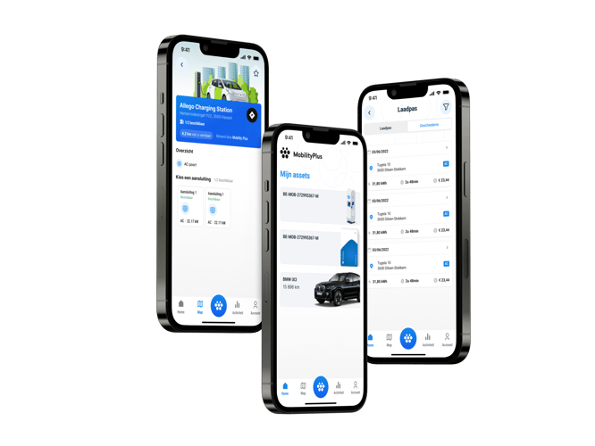
To truly meet your users where they are, mobile often plays a crucial role.
That’s why our digital product team works hand-in-hand with our mobile experts to create smooth end-to-end experiences, from digital strategy to launch in the app store.

Our core principles
Our work is shaped by a set of core principles that guide us in everything we do. These are more than just catchphrases; they characterize our way of thinking, working together, and producing outcomes. As a team, they embody our values: visionary, pragmatic, and unwaveringly value-focused.


Big-picture thinking
We see both the forest and the trees. We get into the details, but always with the bigger picture in mind. Business, solution or product strategy, we switch context fast and keep it all aligned.


Co-creation
We solve complex problems by working together and bring in diverse perspectives and the right mix of skills. It’s a multidisciplinary approach without the unnecessary complexity or overhead.


Data-driven
Our decisions are driven by data. We trust in evidence to guide our strategies and keep everything we do supported by insights and analysis, not gut instinct or personal opinion.


Impact-focused
We design digital experiences that truly have an impact, rather than ‘beautiful screens’. Our drive is to deliver authentic outcomes that improve market performance and real change.


Sustainability
We design with inclusivity and long-term sustainability in mind. Our commitment to ethical practices and social responsibility guides us in creating solutions that serve diverse stakeholders. We build lasting partnerships with our customers and guide them far beyond the initial launch.


Practical execution
Practicality over theoretical perfection. Our iterative process ensures fast experimentation and adaptation based on real-world feedback.
Digital Roadmap
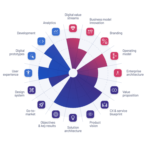
Turn complexity into clarity with a digital strategy rooted in user needs and business goals.
- Digital Business & Service Design
- Strategic Planning
- Market Research
- Customer Journey Mapping
- Service Design Blueprinting
- Business Model Innovation
Product Vision & Strategy
We help define product direction, shape business alignment and validate assumptions before you build.
- Strategic Planning
- Prototyping & Concept Development
- Go-to-market Strategy
- Market Research
Proof of Value
We prototype, validate and iterate before launch, making sure your end-product delivers real user value.
- UI Design
- Interaction Design
- Design System Development
- Information Architecture
- Prototyping & Concept Development
- User Testing
Design System
We build and implement design systems that unify teams and accelerate delivery across all touchpoints.
- User Experience Design
- Design Sprint
- Interaction Design
- UI Design
- Information Architecture
- Design System
Product Design
Intuitive, accessible, and elegant interfaces. Built with your users at the core.
- User Experience Design
- Design Sprint
- Interaction Design
- UI Design
- Information Architecture
- Design System
User Experience Audit
Together we evaluate and enhance the user experience of existing products.
- User Research
- User Testing
- Experience Strategy
- User Journey Mapping
- Interaction Design
Product Management Coaching
Equip teams with the skills and frameworks needed to execute and manage digital products effectively.
- Product Management
- GTM Strategy
- Strategic Planning
- Customer Journey Mapping
Ready to create a digital experience your users will love?
Let’s create digital products with real impact. We are happy to support you from idea to launch!

Ready to create a digital experience your users will love?
Let’s create digital products with real impact. We are happy to support you from idea to launch!

Ready to create a digital experience your users will love?
Let’s create digital products with real impact. We are happy to support you from idea to launch!

Ready to create a digital experience your users will love?
Let’s create digital products with real impact. We are happy to support you from idea to launch!

Blogs
More about digital experiences
Dive into our blog for expert tips insights into creating user-centered digital products.


A great mobile app isn’t just about flashy features or sleek design. It’s about a team that knows how to write maintainable code, make smart decisions, and -most importantly- always puts the user first. That’s exactly what our mobile team does every single day. We sat down with Jurgen Geys (Mobile Team Lead) to talk about how the team works, their technical choices, and why ACA is the perfect place for developers who want to make an impact.
Read more

Our Business expert in Energy Utilities Tom Claus headed to Energy Mission, and came back with some new insights… and a wake-up call for companies and (government) agencies.
Read more

ACA Group is officially ISO 27001 compliant. For our customers, this certification is more than a formal milestone: it is clear, independent proof that information security is embedded in how we design, build and deliver software. Information Security Manager Simon Vercruysse explains what ISO 27001 entails and what the benefits are for your (future) projects.
Read more.png?width=107&auto=compress,webp&upscale=true)


